Project Overview
The Usta Dönerci rebranding project focused on refreshing a well-established Turkish fast-casual food brand while preserving its authentic, familiar spirit. I led the design process from initial concept to final rollout, developing a contemporary visual identity that feels warm, approachable, and full of character.

Design Problem
Usta Dönerci had built strong recognition as a trusted Turkish fast-casual brand, yet its visual identity had not evolved alongside the brand’s growing presence. The existing system felt fragmented across packaging, signage, and digital platforms, making it difficult to deliver a consistent customer experience.
The design problem was to modernize the brand without losing its traditional roots, creating a cohesive identity that communicates warmth, quality, and the brand’s lively personality across every application.

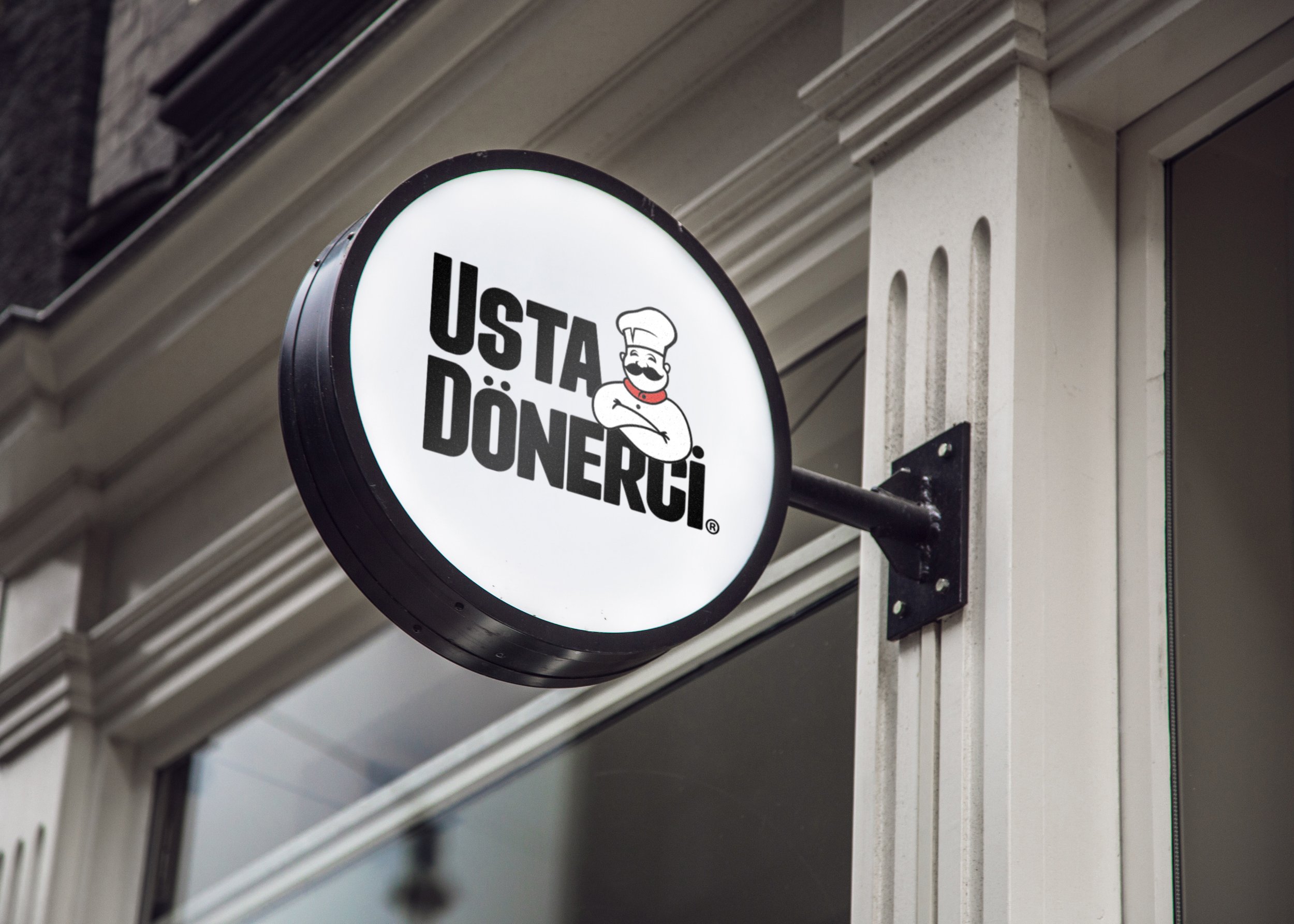
BEFORE
AFTER
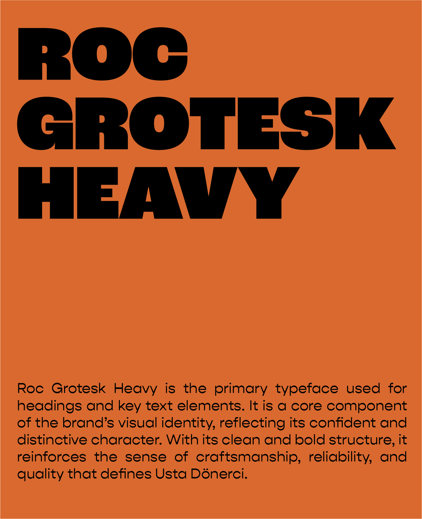
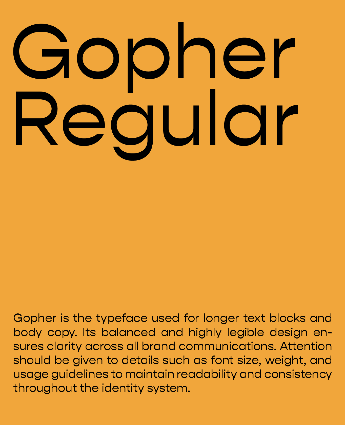
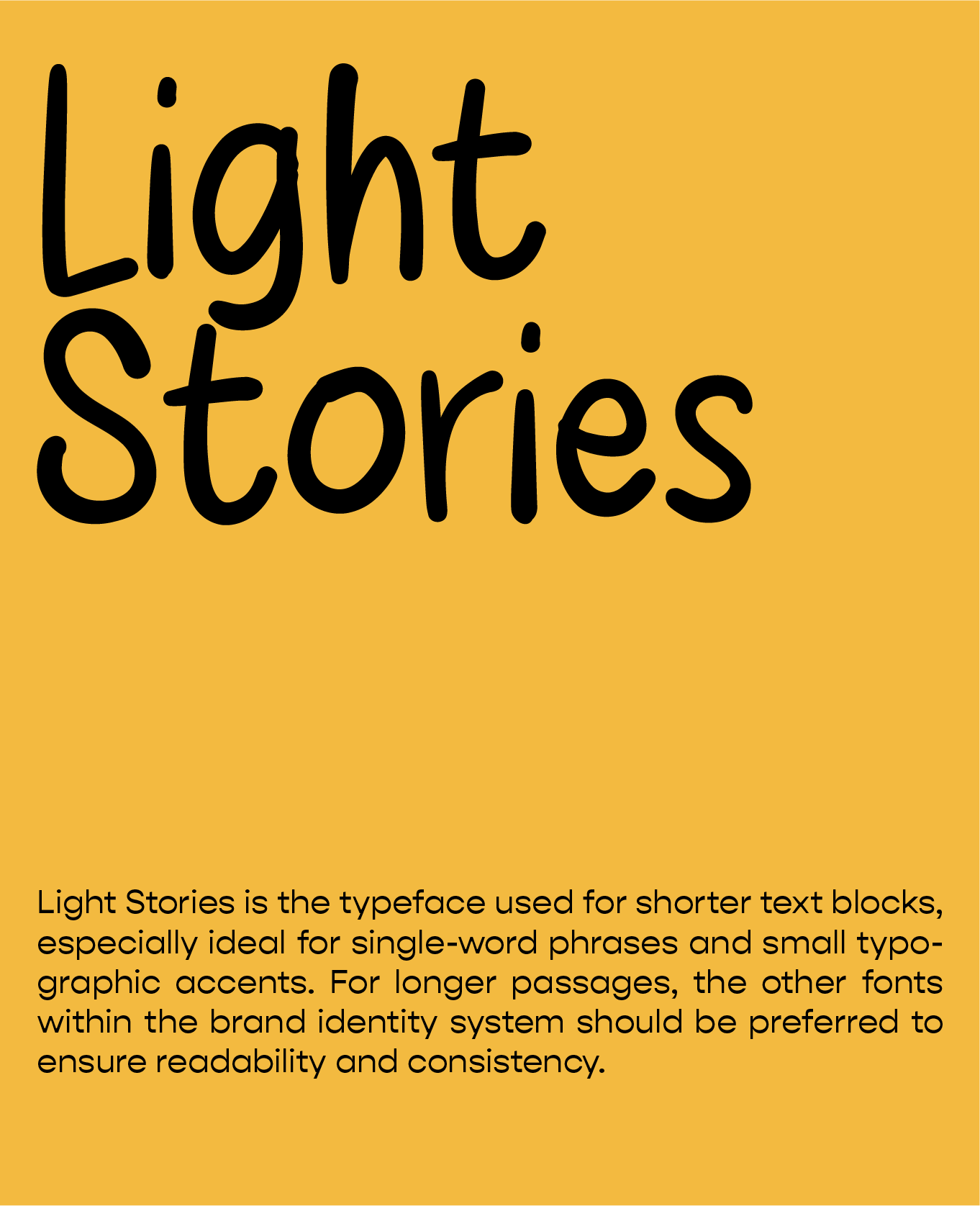
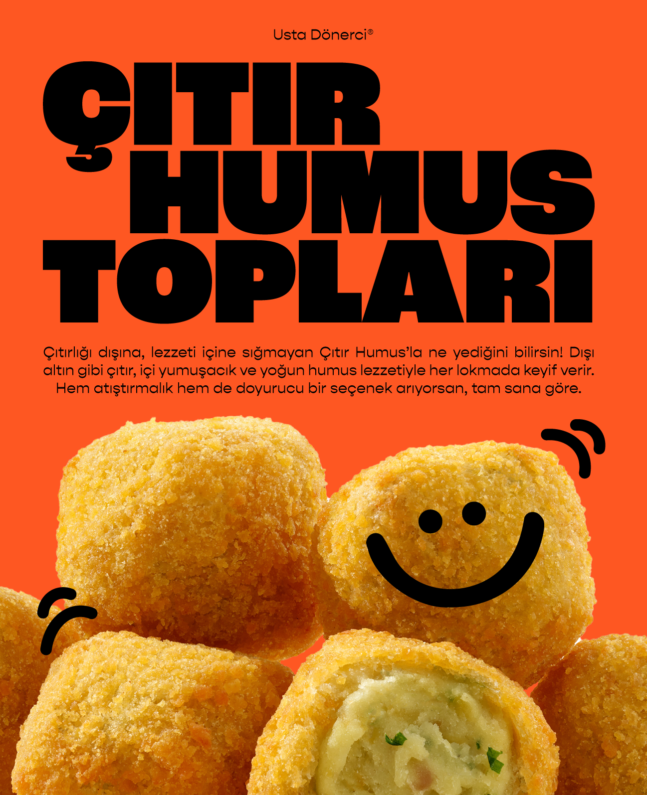
Typography
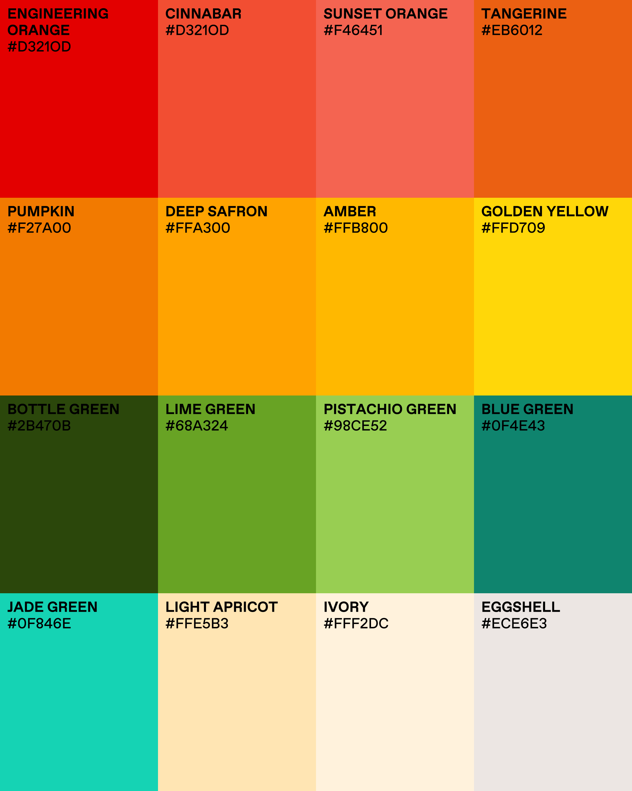
Color Palette & Patterns
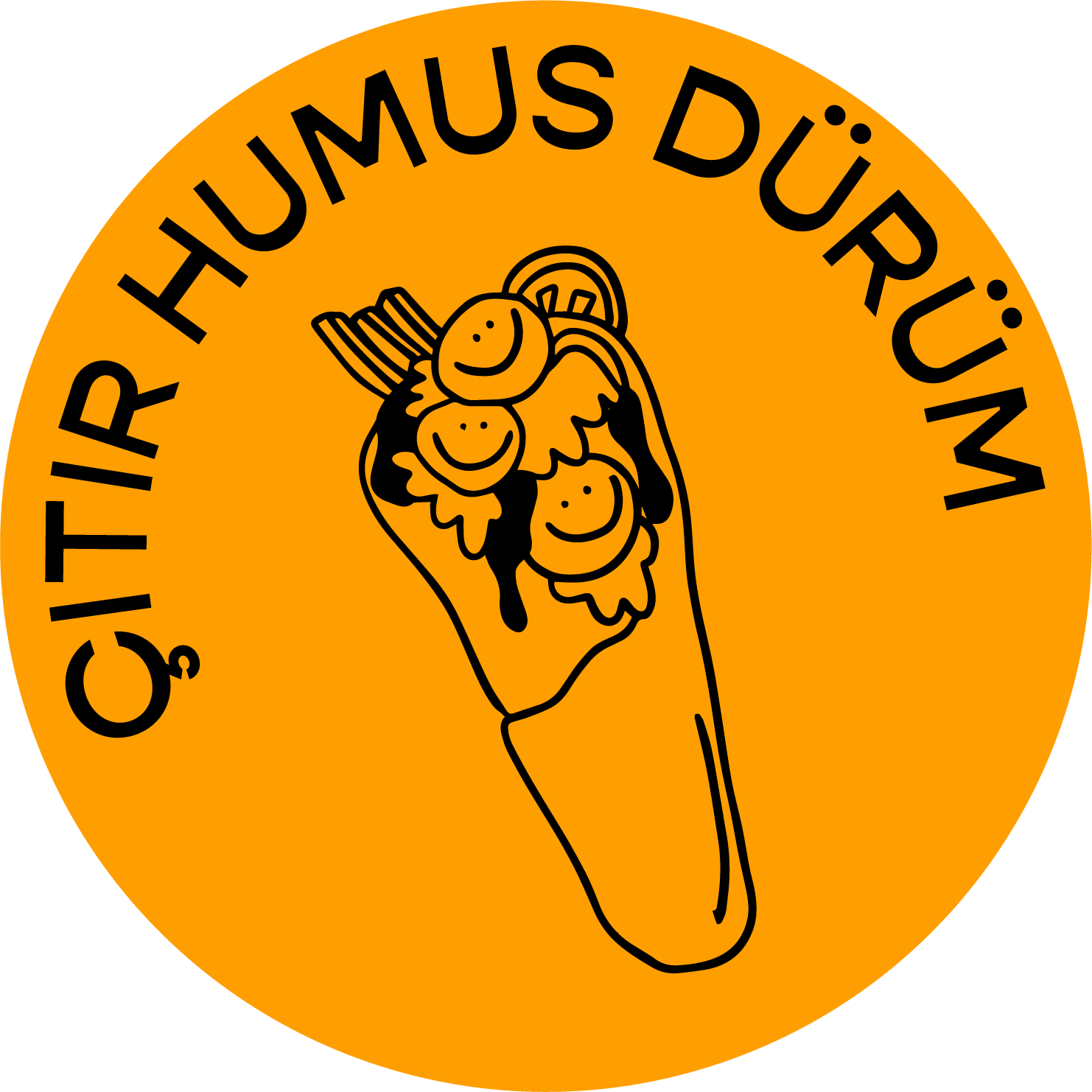
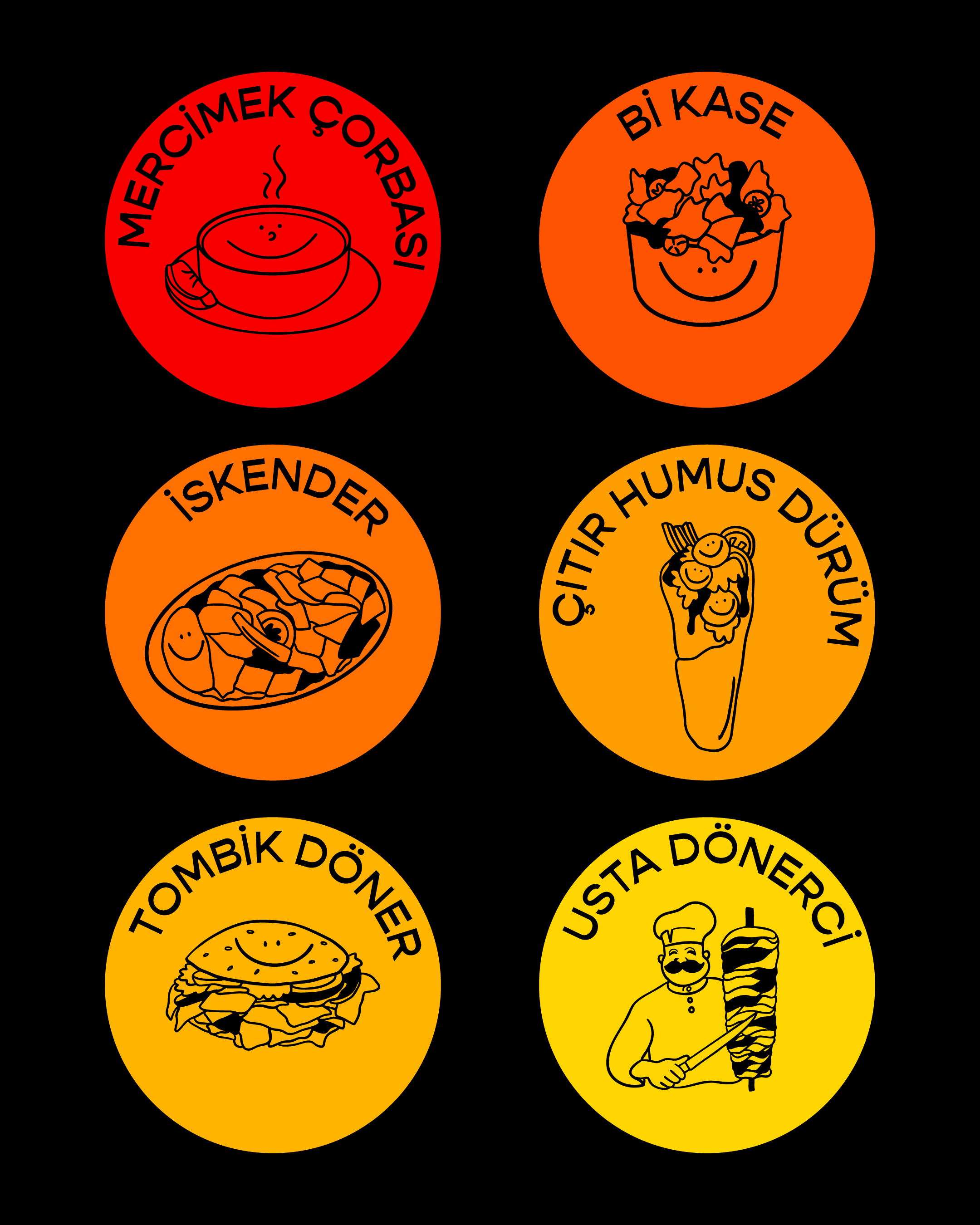
For Usta Dönerci’s rebranding, we built a color world inspired by Walrus Creative Works’ original visual language, which drew subtle references from Ottoman heritage through rich turquoises and deep greens. As a modern food chain, the brand also needed a warmer, more appetite-driven energy, so we introduced bold “yummy” tones like orange, red, and yellow.
Alongside the palette, we developed ornamental pattern elements that nod to Ottoman motifs and the cultural legacy of döner, reinforcing the idea of tradition carried into a contemporary fast-casual identity.

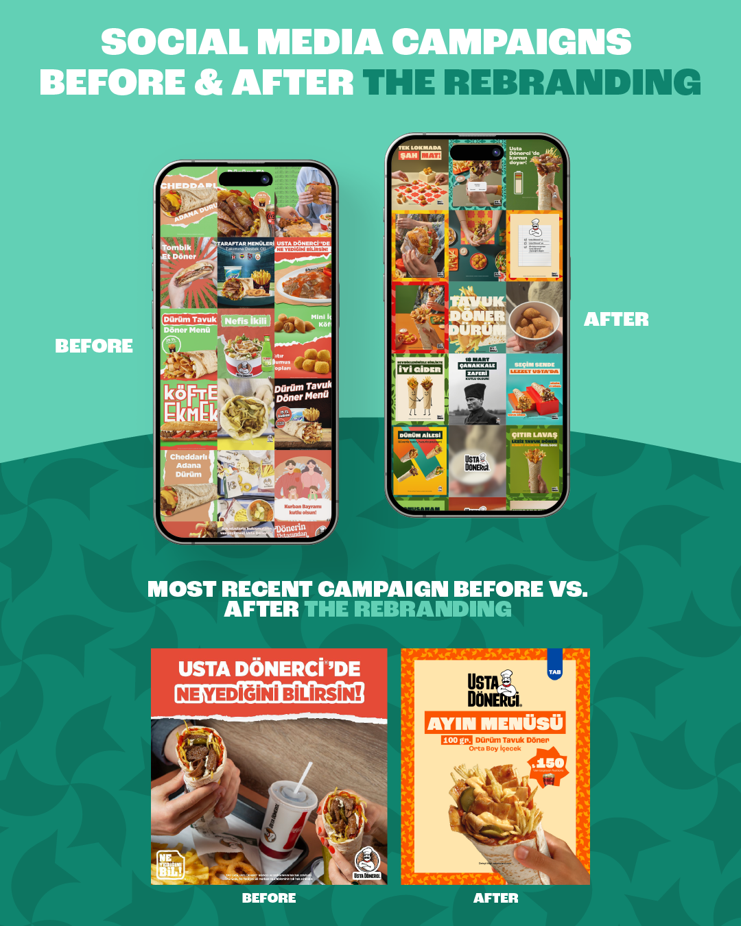
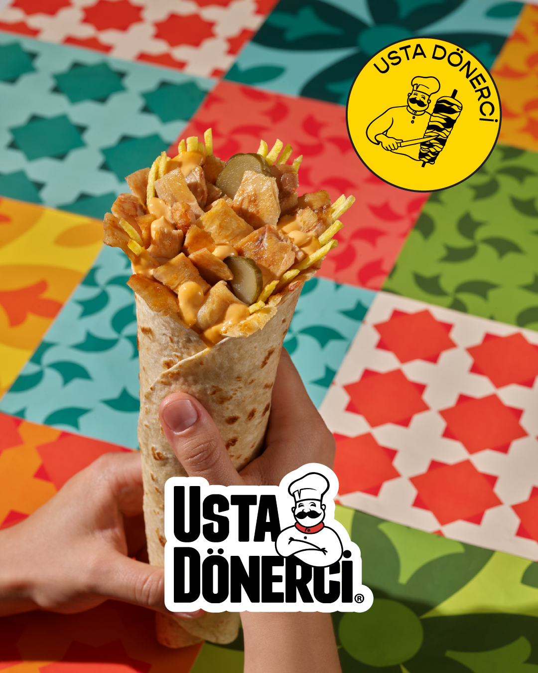
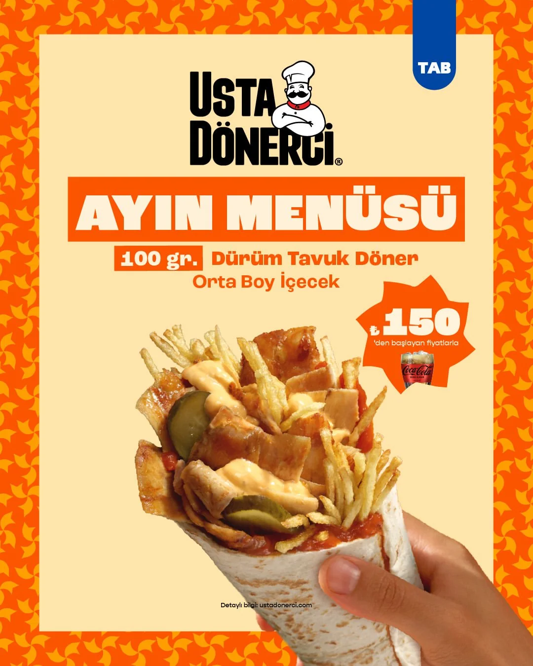
Social Media Design
〰️
Social Media Design 〰️
As part of the rebranding process, the brand’s social media presence was completely redesigned to create a more consistent and recognizable visual identity. The previous content relied on crowded layouts and mixed graphic styles, while the new campaign system focuses on cleaner compositions, stronger typography, and a cohesive color palette.
This transformation resulted in a more modern, structured, and impactful feed that better reflects the brand’s updated tone and positioning.